
Logos
Years
2021-25
✹
Description
Selected logos created for the Nashville Predators organization. All marks were created to fit within the Predators existing brand while also evoking unique qualities based on the event or initiative represented.


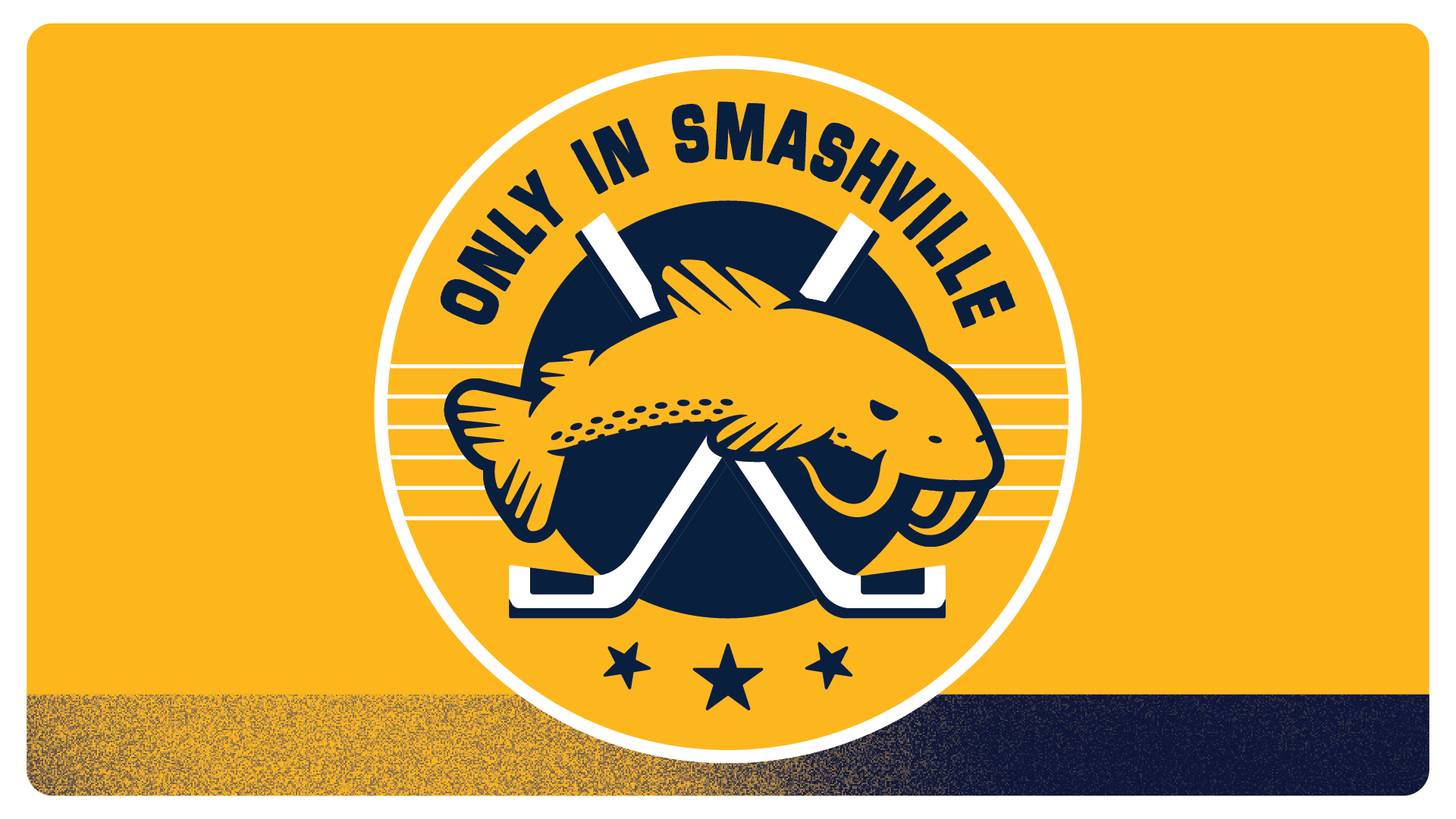
Year
2025-Present
Creative Team
Jackie Fisher (Art Direction)
Courtney Mitchell
Tayshaun Hassell
Joe Scilingo (Motion Design)
✹
Brand Strategy
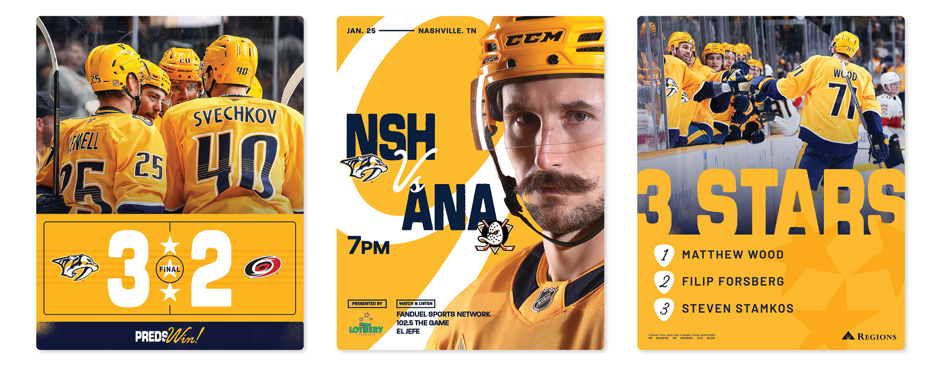
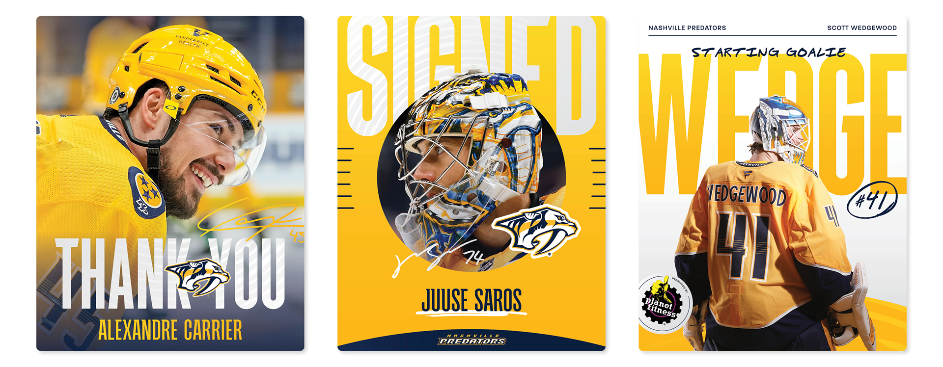
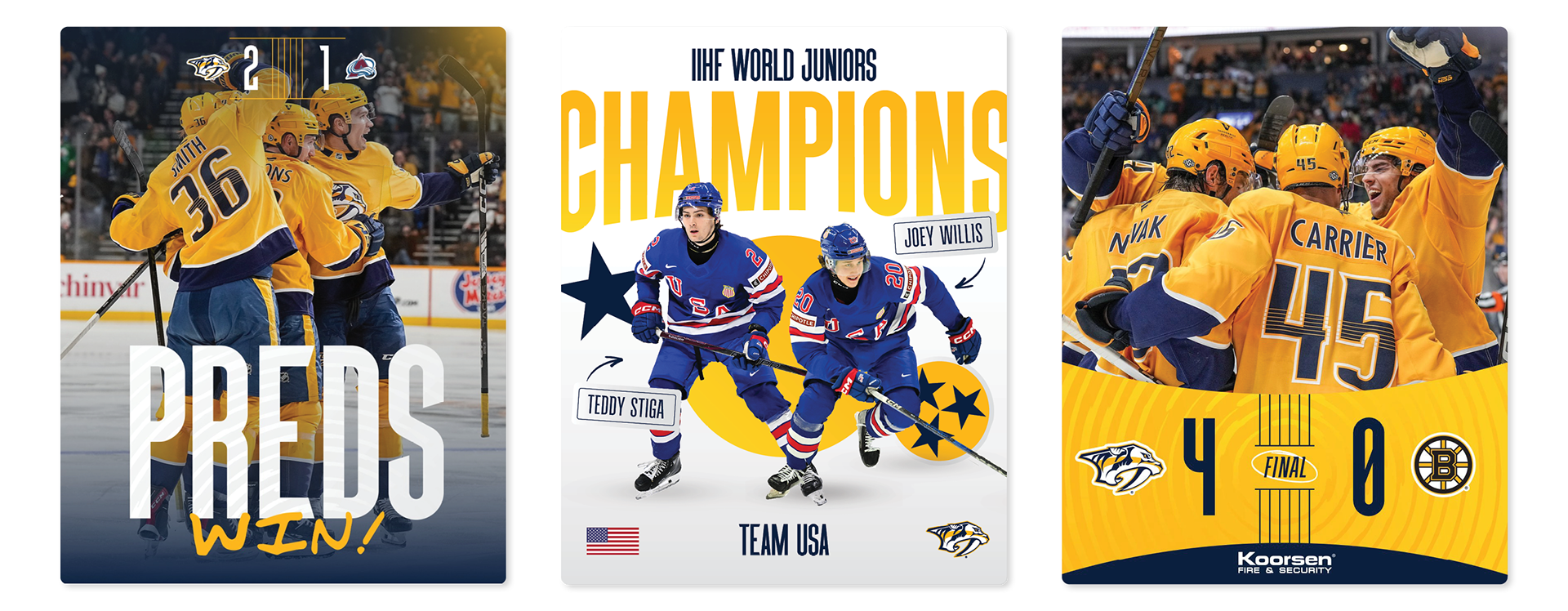
This season's campaign "Only in Smashville" was designed to serve as a tribute to all of the things that make Nashville such a great and unique hockey town, from traditions like throwing catfish on the ice to the "Hey, You Suck!" chants from the fans. Every design element was created to showcase the energy, passion, and joy that this city has for the team. The Preds are unapologetically loud and unorthodox, and the campaign needed to reflect these things that are found Only in Smashville.
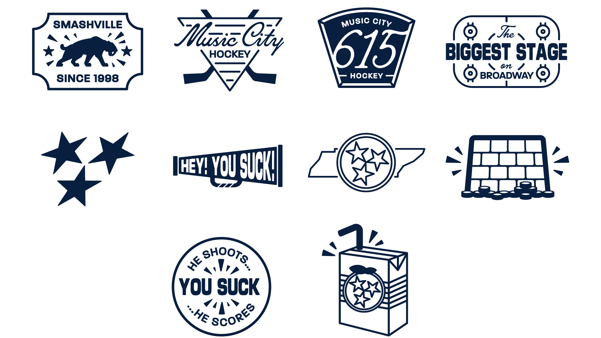
Stamp System
Over the summer when thinking of ways to visualize the concept of "Only in Smashville", I created a living system of stamps that function as everything from background textures to icons that further brand Preds content. They reference specific aspects of Nashville culture as well as fun illustrations of fan traditions.

Commemorative Posters
Year
2024-25
Creative Team
Jackie Fisher (Art Direction)
Courtney Mitchell
Tayshaun Hassell
Joe Scilingo (Motion Design)
✹
Brand Strategy
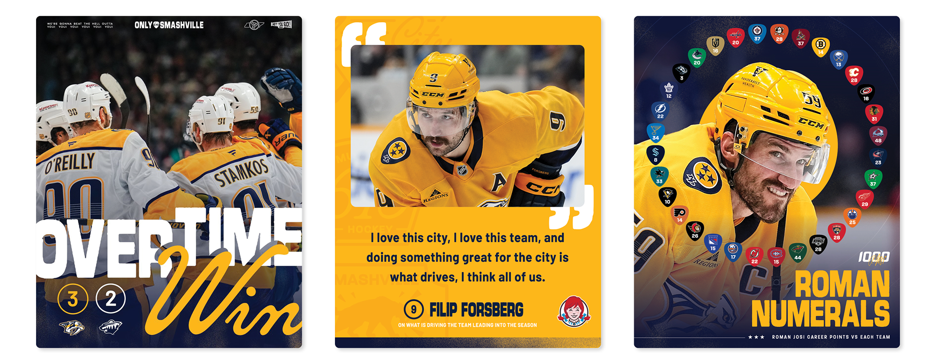
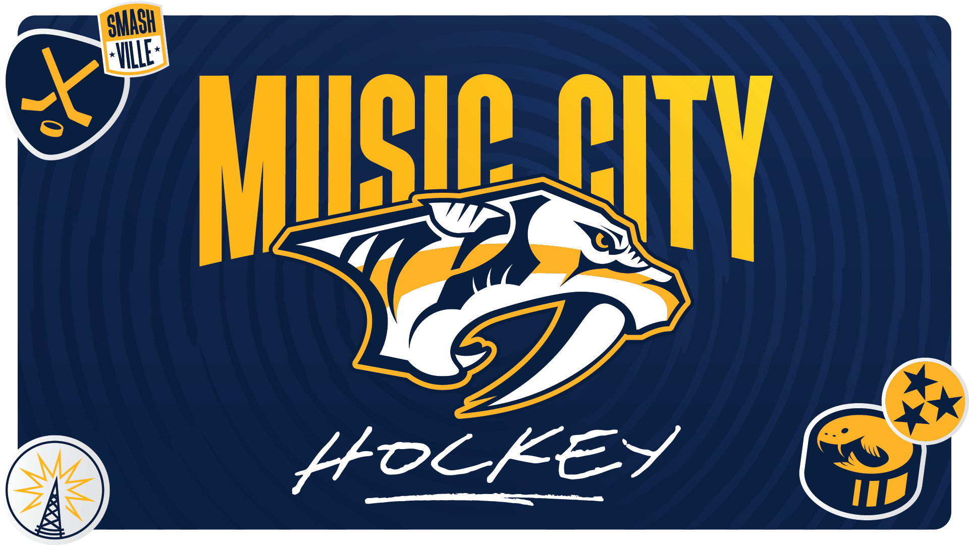
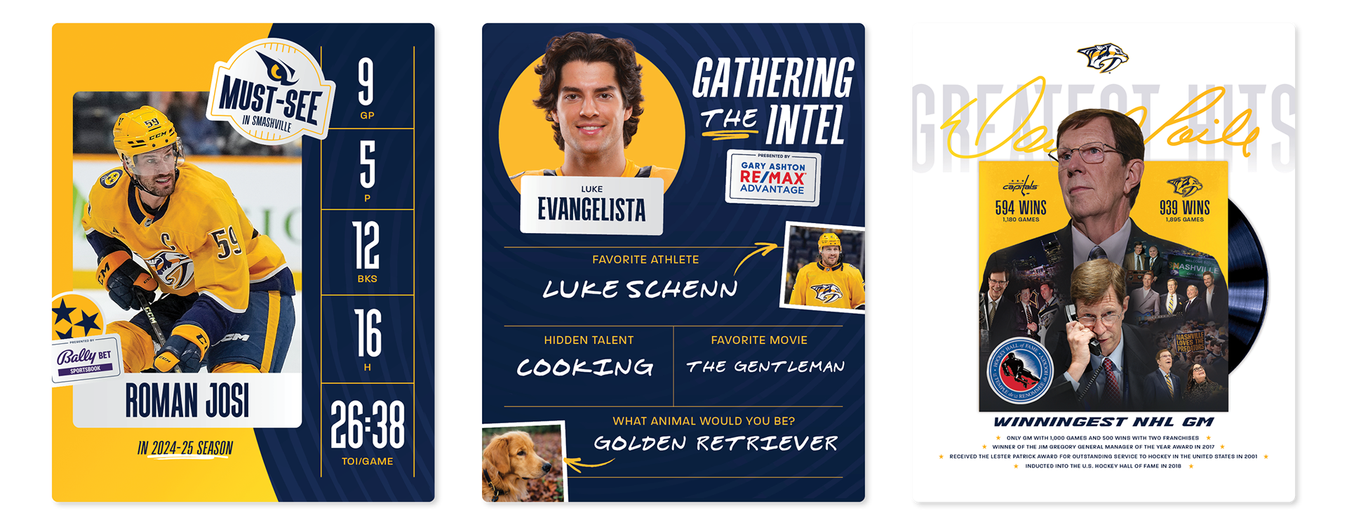
"Music City Hockey" was the genesis of this season's visual theme, a simple tagline that speaks to Nashville's reputation as a hub for music and creativity. The organization wanted to further lean into the cultural aspects of Nashville as a music and creative center in order to create a season campaign that would equally resonate with both visitors and diehard fans alike.

Visual Variety
A big emphasis was placed on featuring more visual variety within the graphic system this year, which necessitated the prep of a more robust toolkit. The two foundational pieces came in the form of a sticker set and unique background pattern- The stickers being inspired by Record Store ephemera, and the pattern being a more abstracted take that resembles record grooves, sound waves, tiger stripes, etc. depending on the context used and how it is cropped within any given composition.
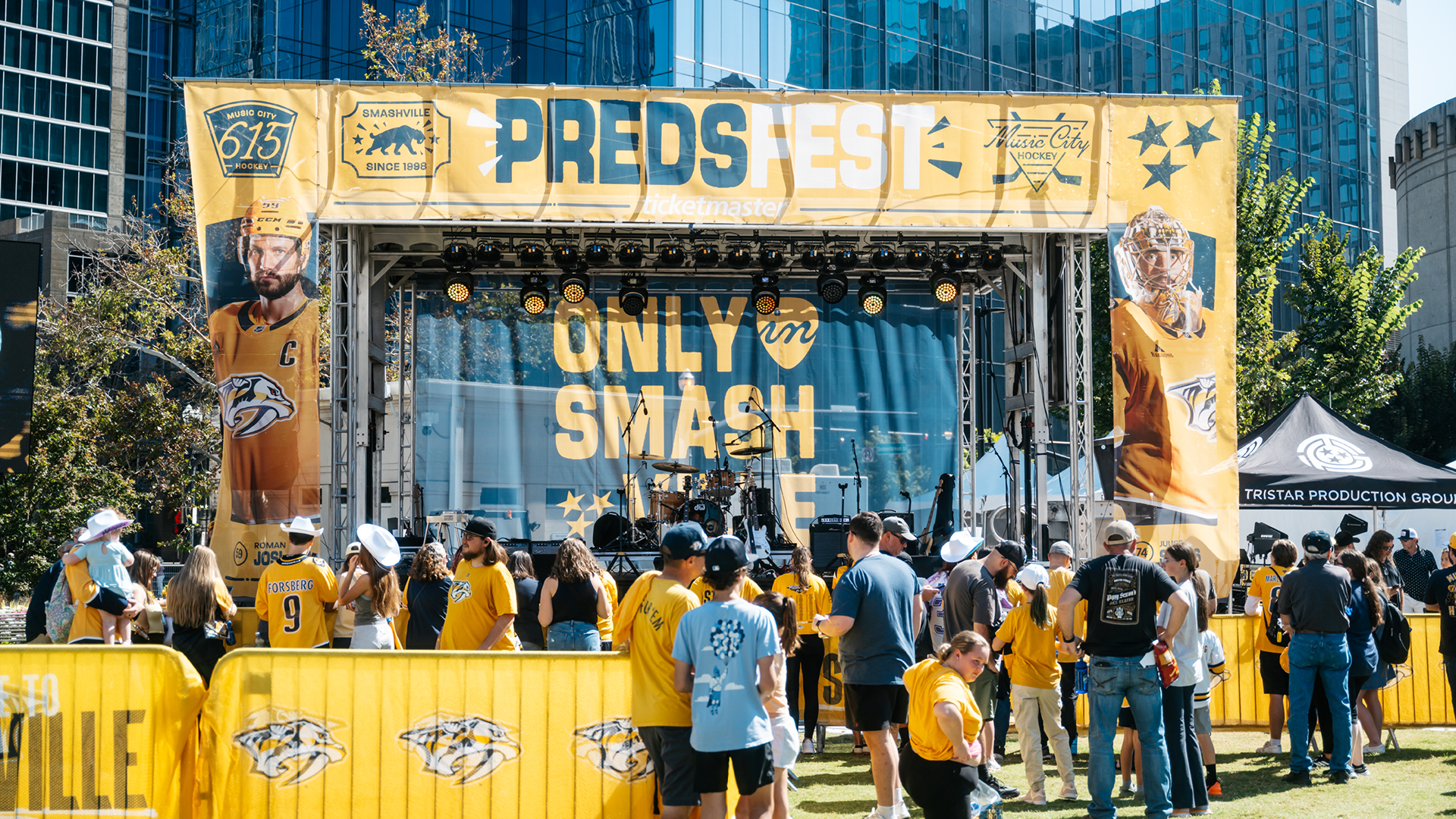
Social Graphics
A big emphasis was placed on featuring more visual variety within the graphic system, especially for social assets in order to help further separate ourselves from an unforgiving algorithm and encourage fans to be excited to share content pieces from the team.
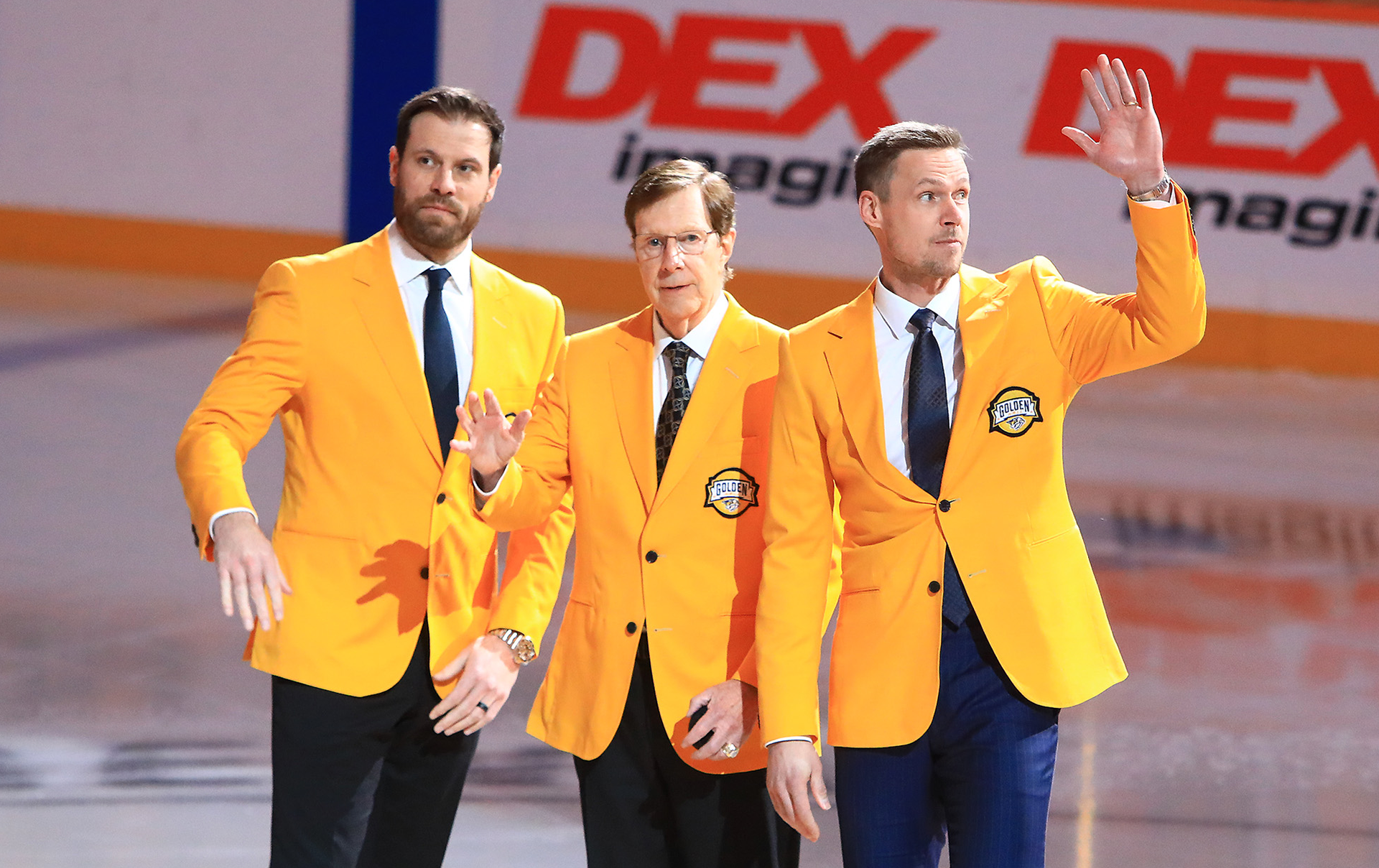
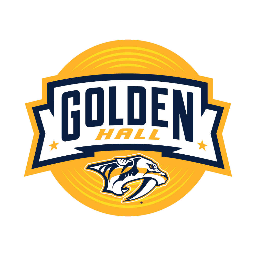
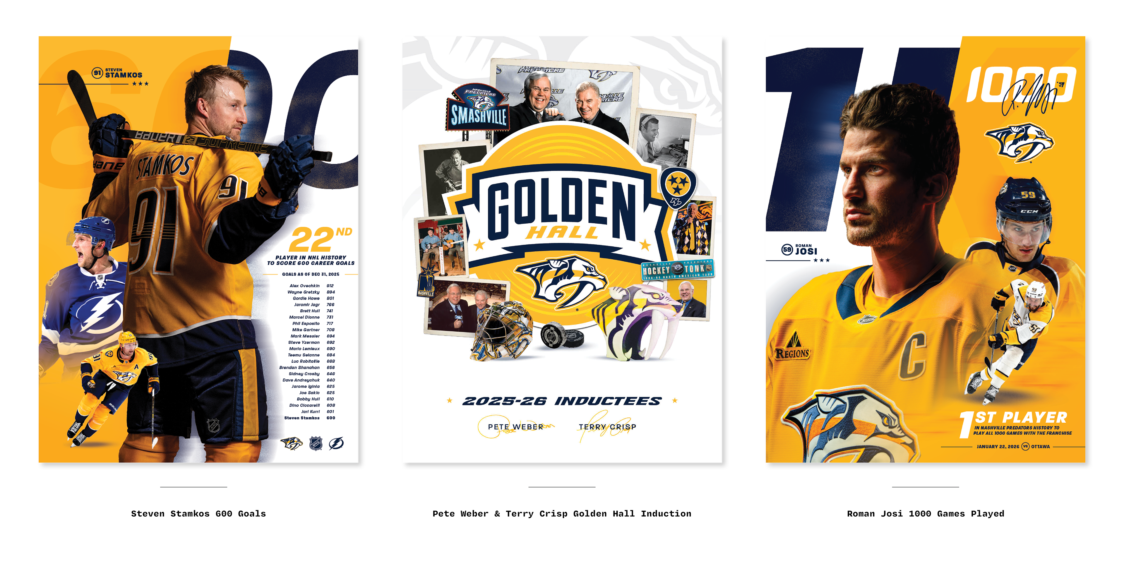
Custom Golden Hall Jackets
Custom Preds Gold blazers featuring an embroidered version of my Golden Hall on the chest are given to all inductees of the new Preds Hall of Fame.
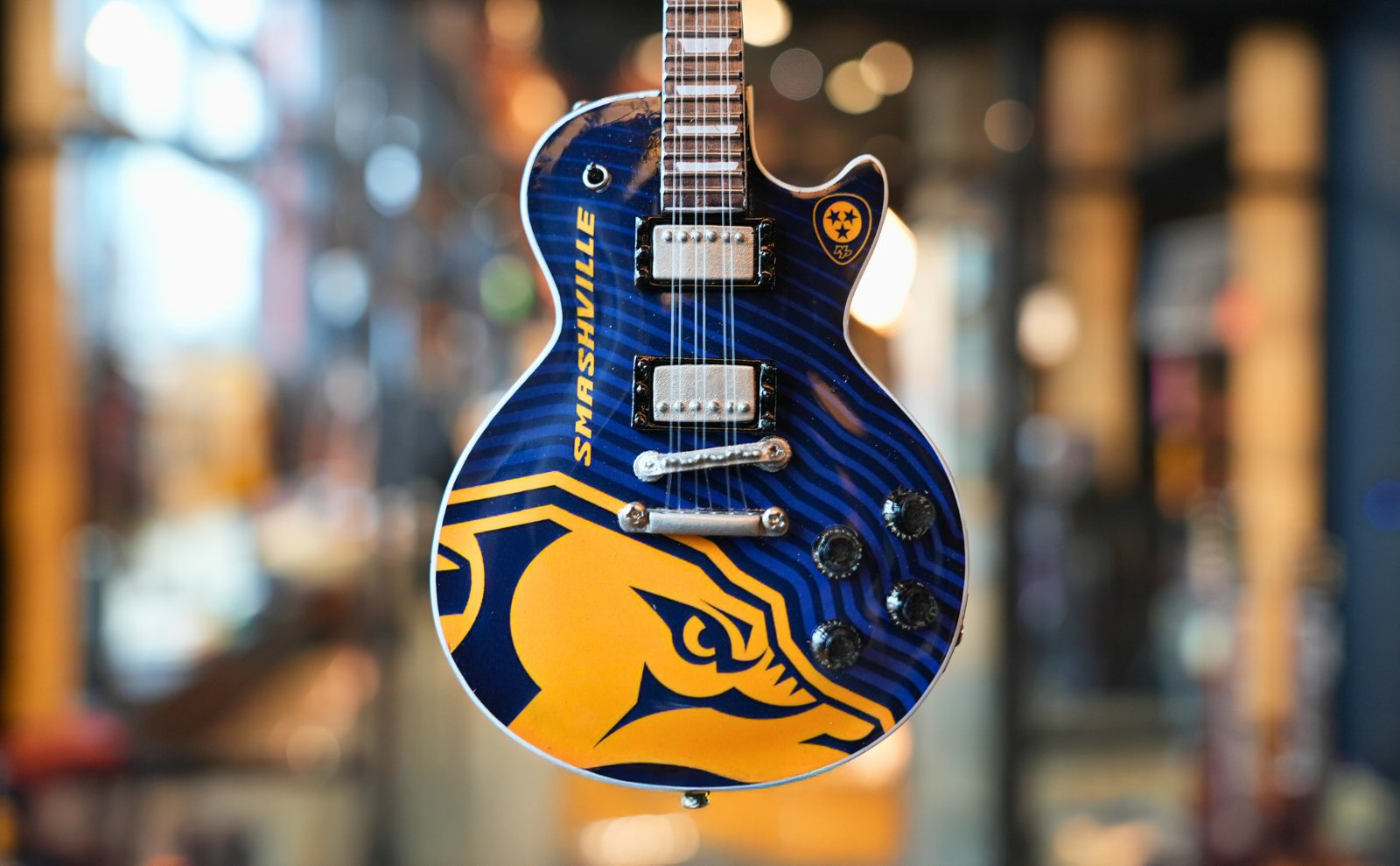
Nashville Predators x Gibson Garage
There's nothing more fitting to embody the "Music City Hockey" tagline than our collaboration with Gibson guitars to create custom Preds-themed designs to sell in our team store.
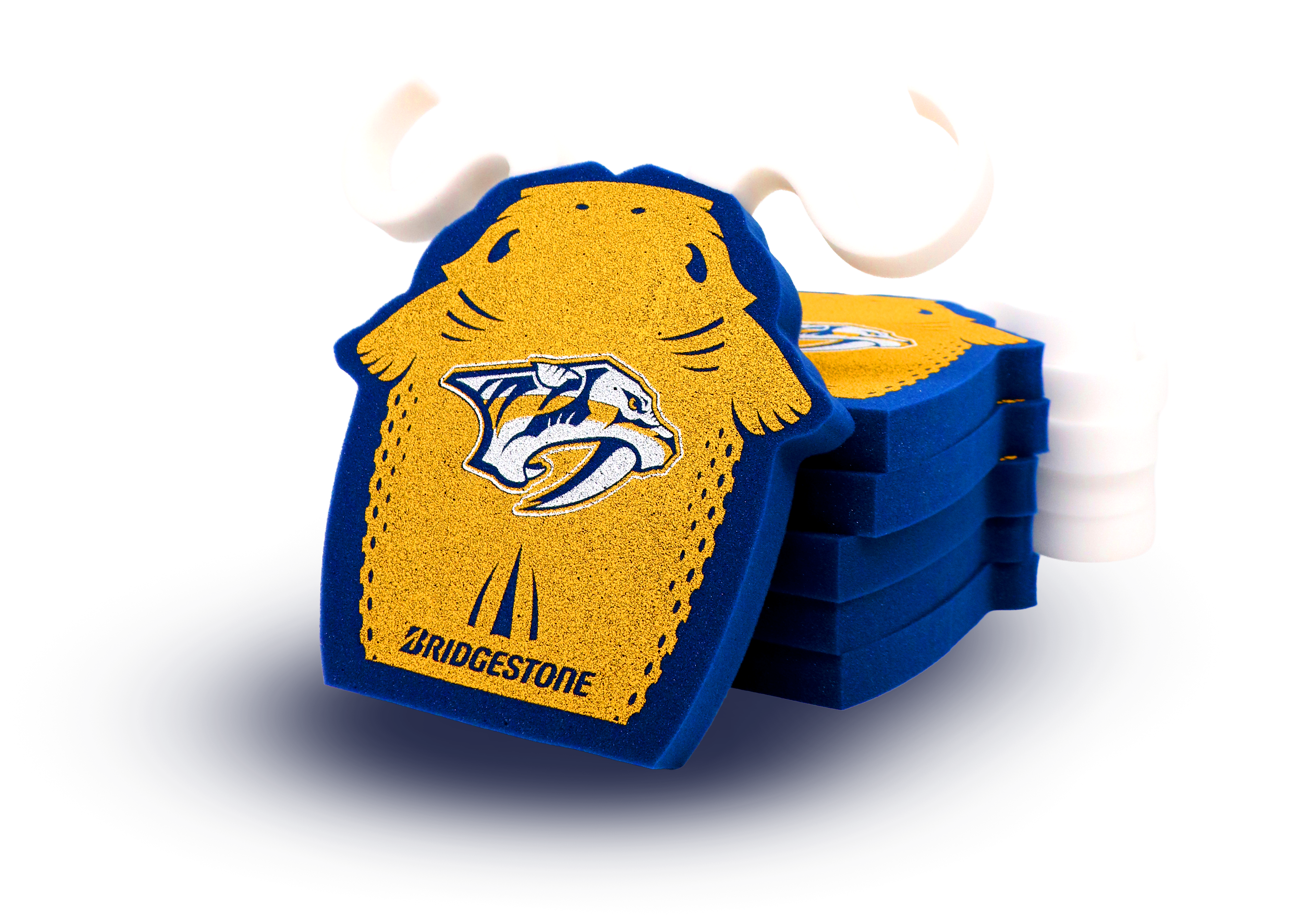
Catfish Foam Fingers
Preds fans know of the iconic Fang foam fingers that have been given to fans since the beginning, and this year our Marketing team challenged me to retrofit the tiger silhouette to fit a Catfish instead, with teeth being replaced by whiskers.
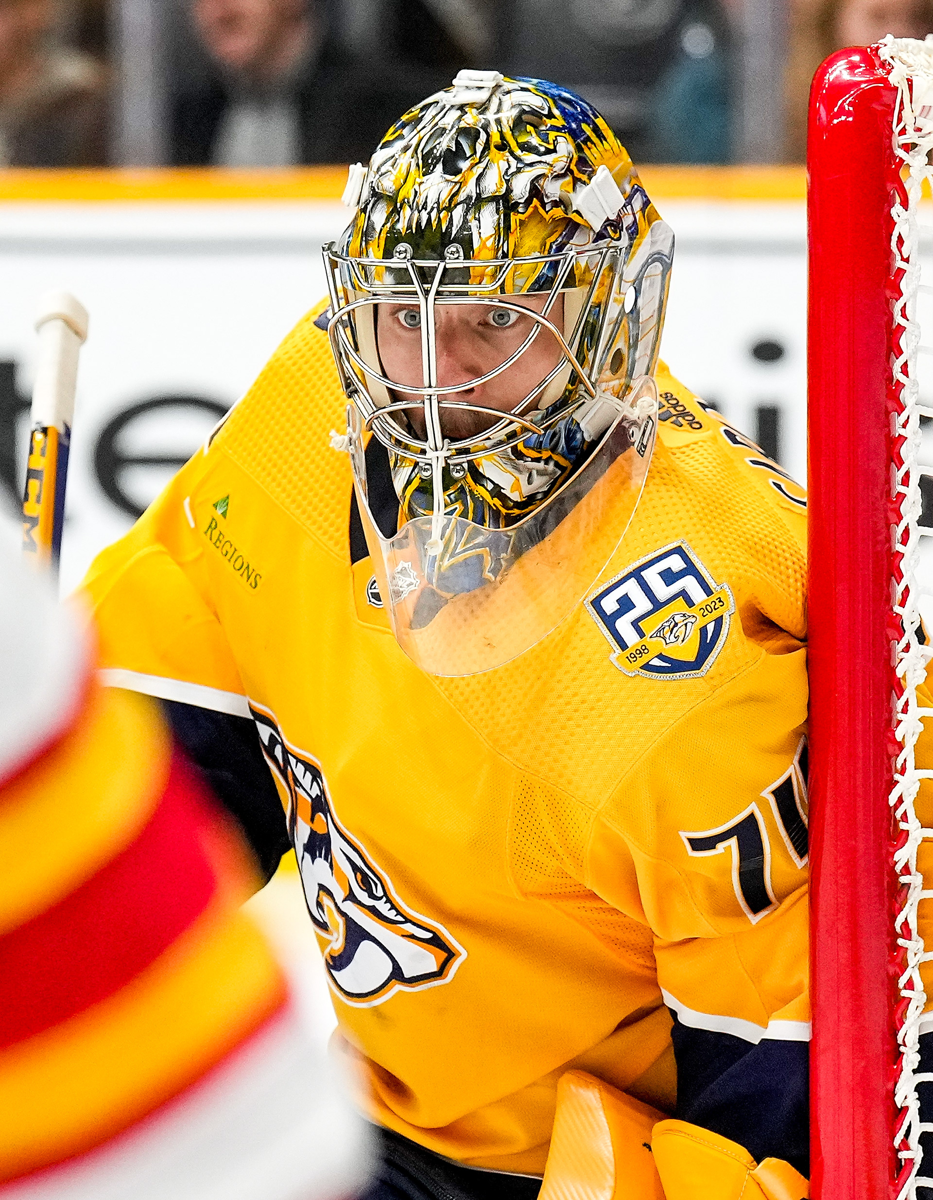
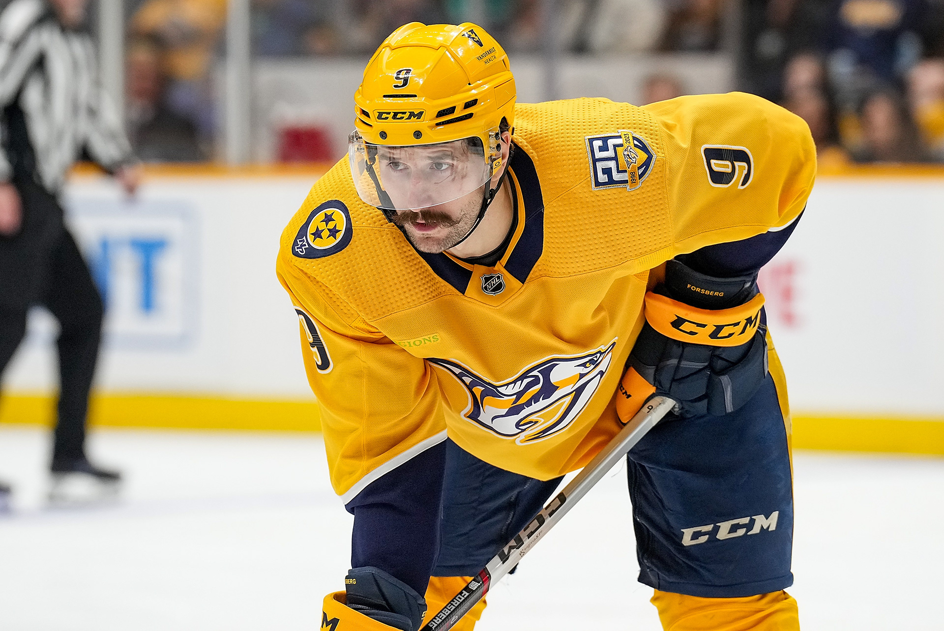
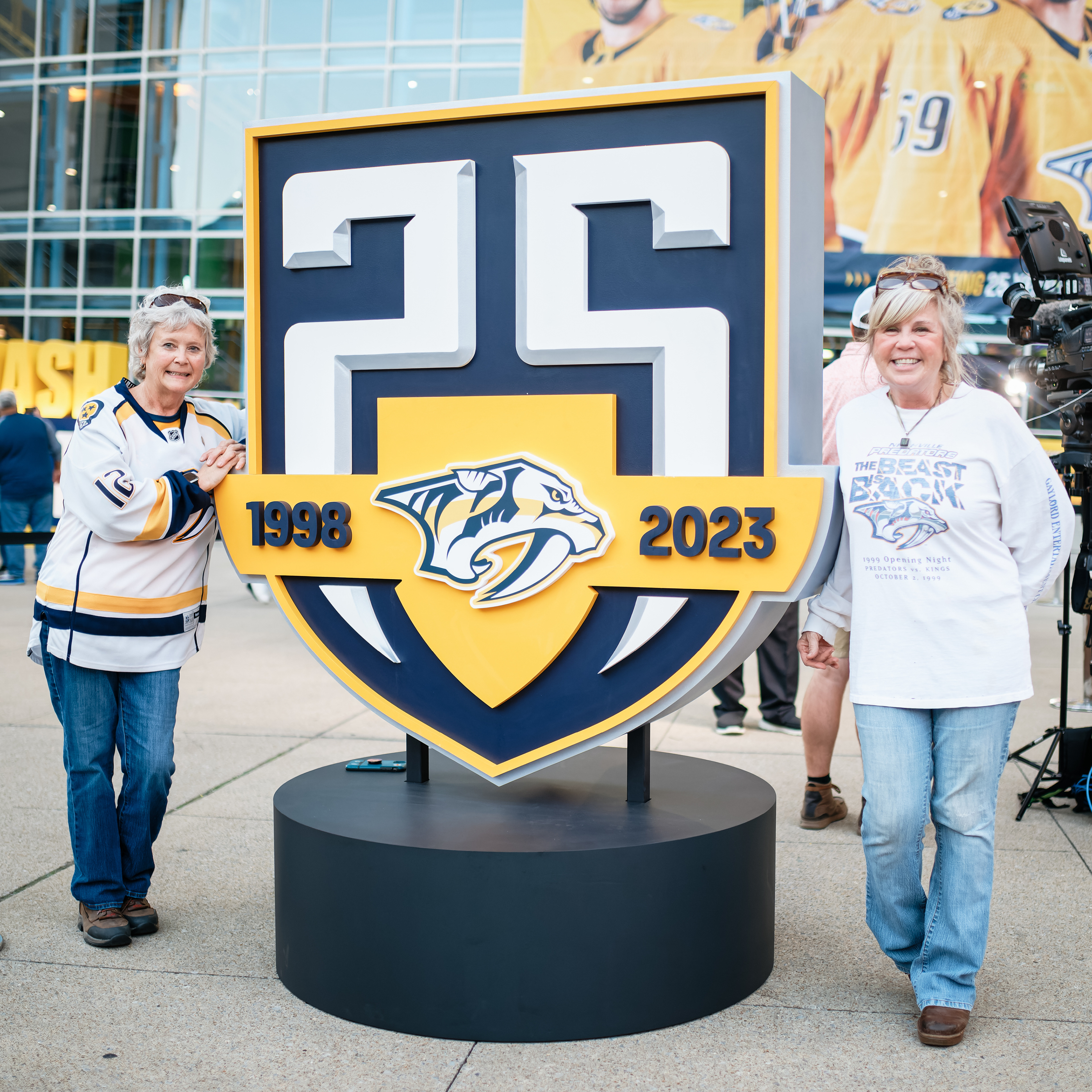
Year
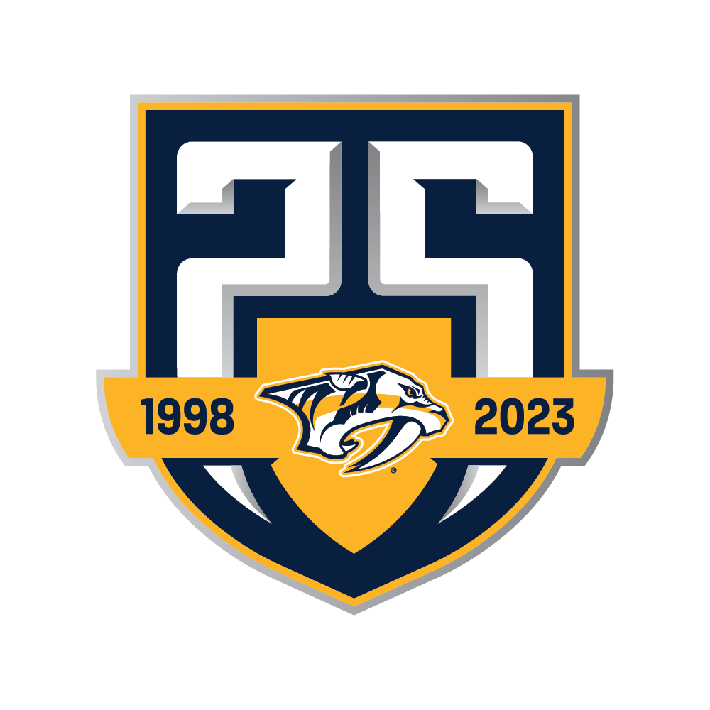
2023-24
Creative Team
Jackie Fisher (Art Direction)
Courtney Mitchell
Karlee Fuller
Tayshaun Hassel
✹
Brand Strategy
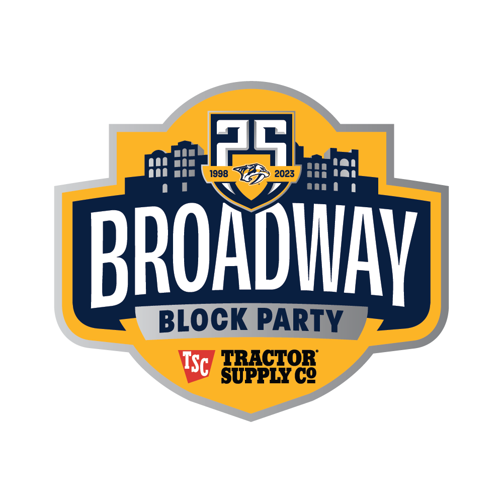
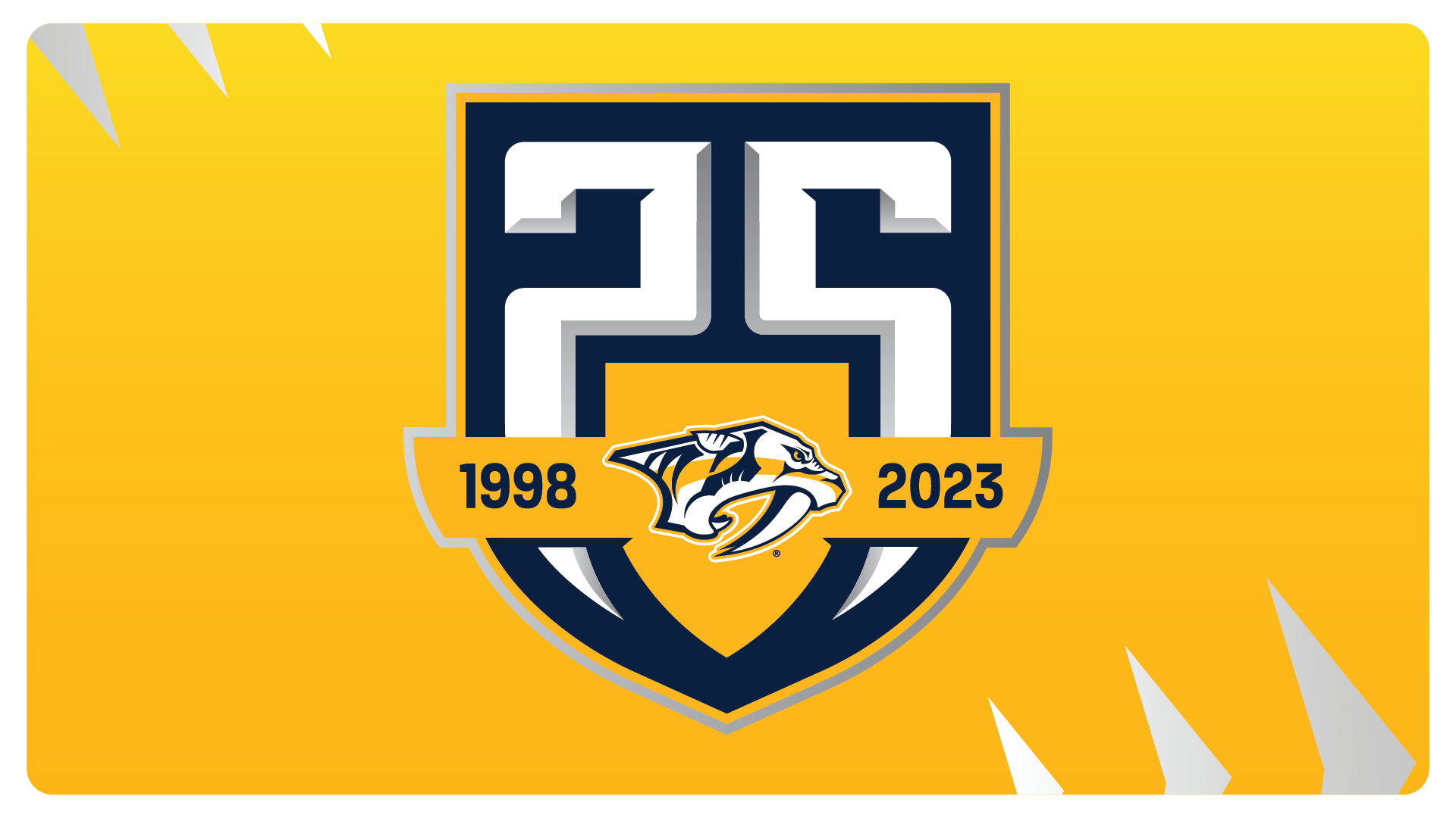
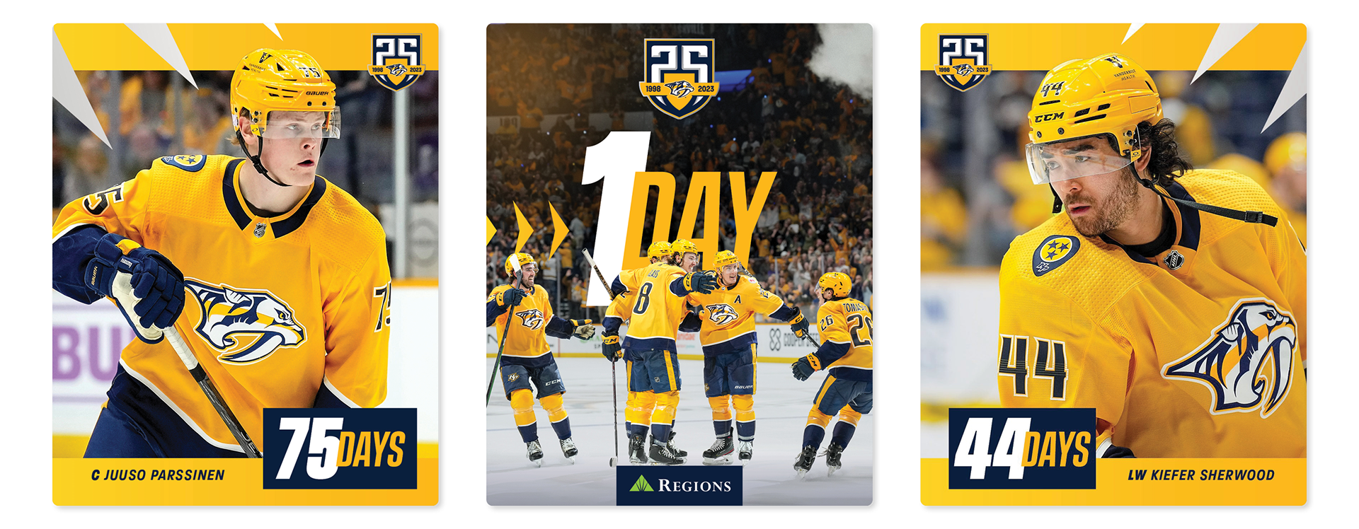
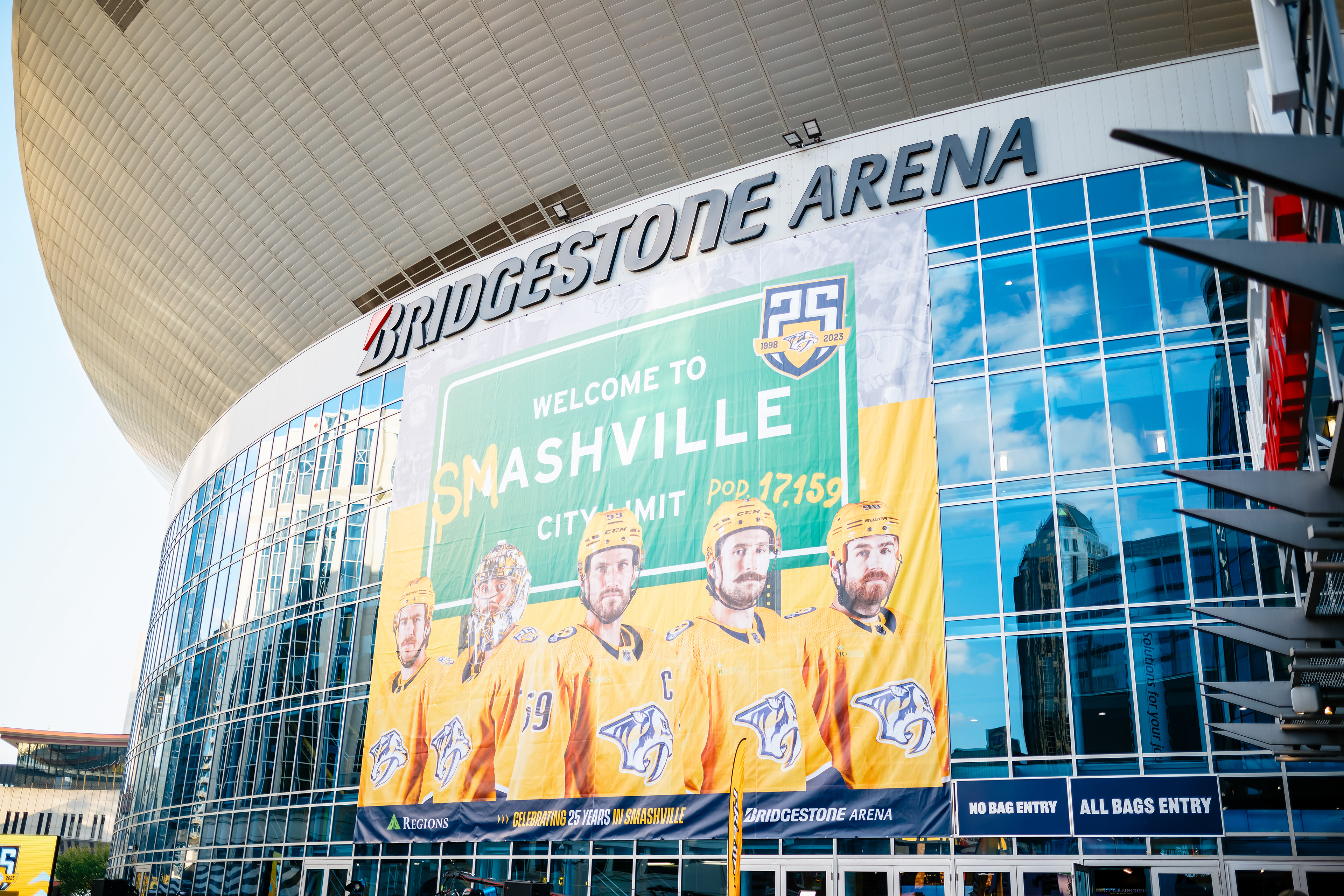
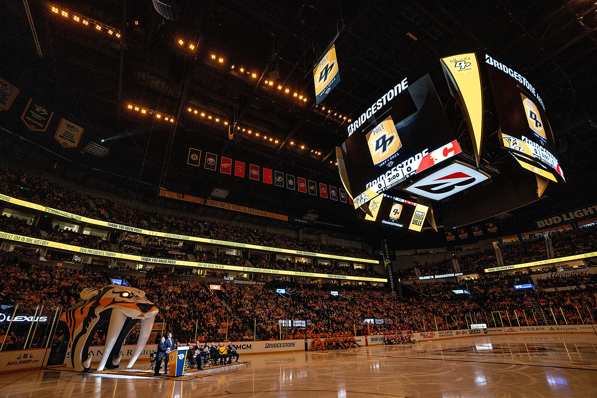
The 25th Anniversary posed a unique storytelling opportunity to recall all of the franchise's greatest moments over the past 25 years while also getting fans excited for the next 25+ years of Predators hockey. The foundation for this idea began with the creation of the 25th Anniversary logo, a mark made to be modern and exciting while also incorporating subtle design details from the original Predators brand as a sort of easter egg to lifelong fans.
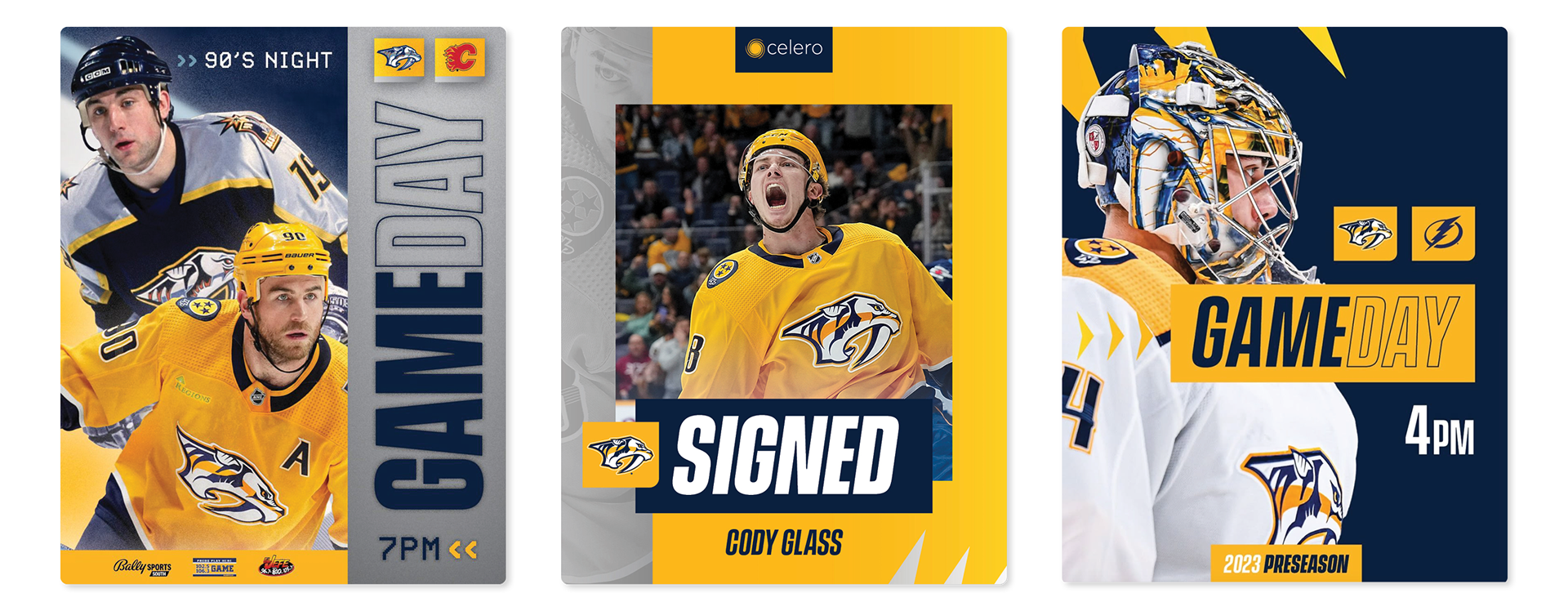
Past meets Present
We took nostalgic elements from iconic campaigns of the past and brought them back prominently in buidling and digital graphics.
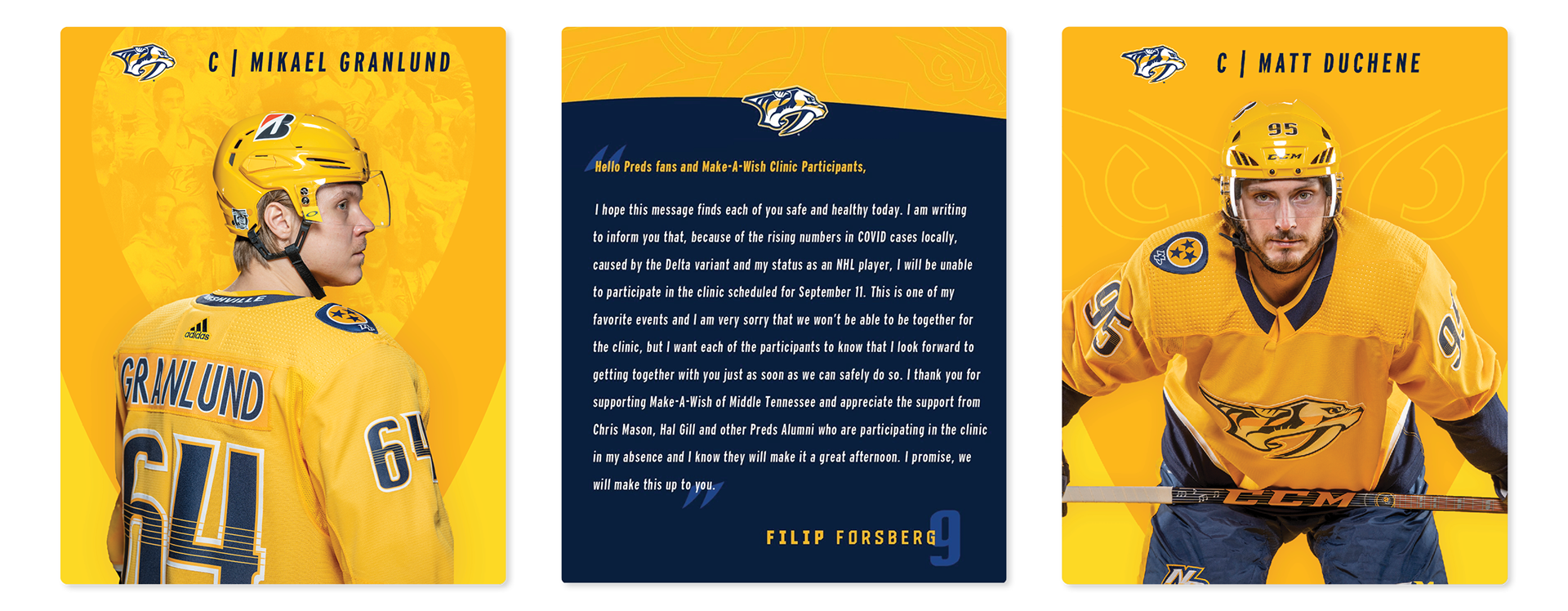
Year
2022-23
Creative Team
Chuck Stephens (Art Direction)
Jackie Fisher
Courtney Mitchell
✹
Brand Strategy
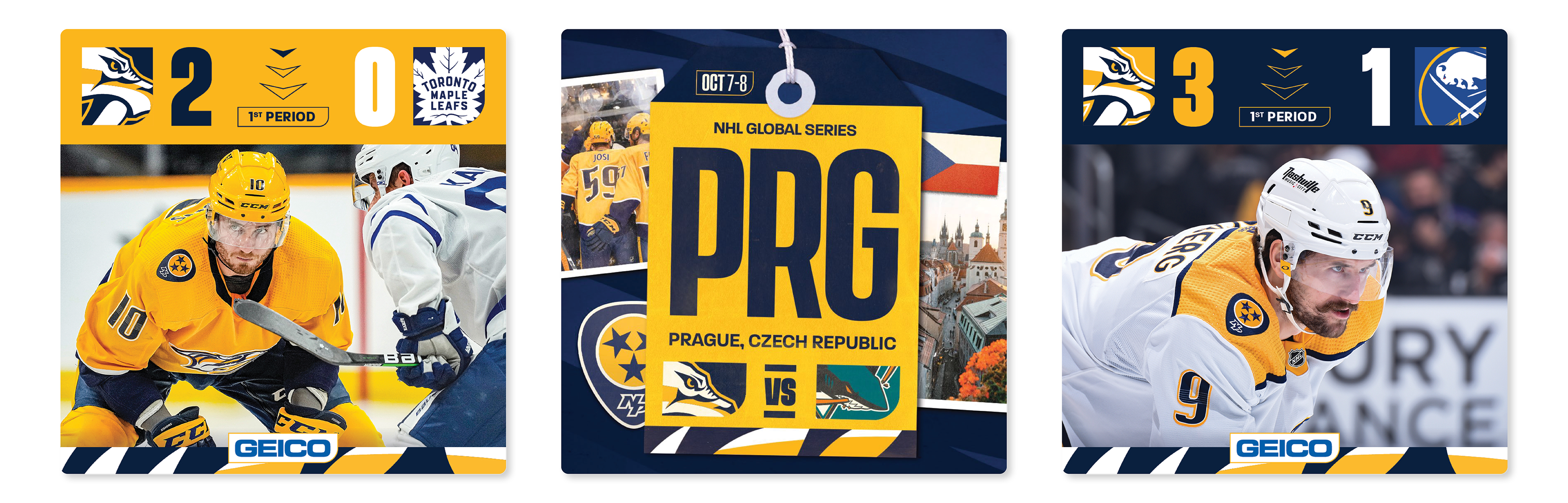
The 2022-23 Season campaign centered around creating a clean, minimalist look to reflect the changing, younger look for the roster. The main traits include logos abstracted within containers and responsive widgets for information.
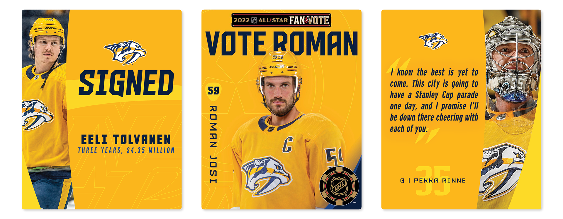
Year
2021-22
Creative Team Collaborators
Chuck Stephens (Art Direction)
Jackie Fisher
Courtney Mitchell
James O'Hara (Motion Design)
✹
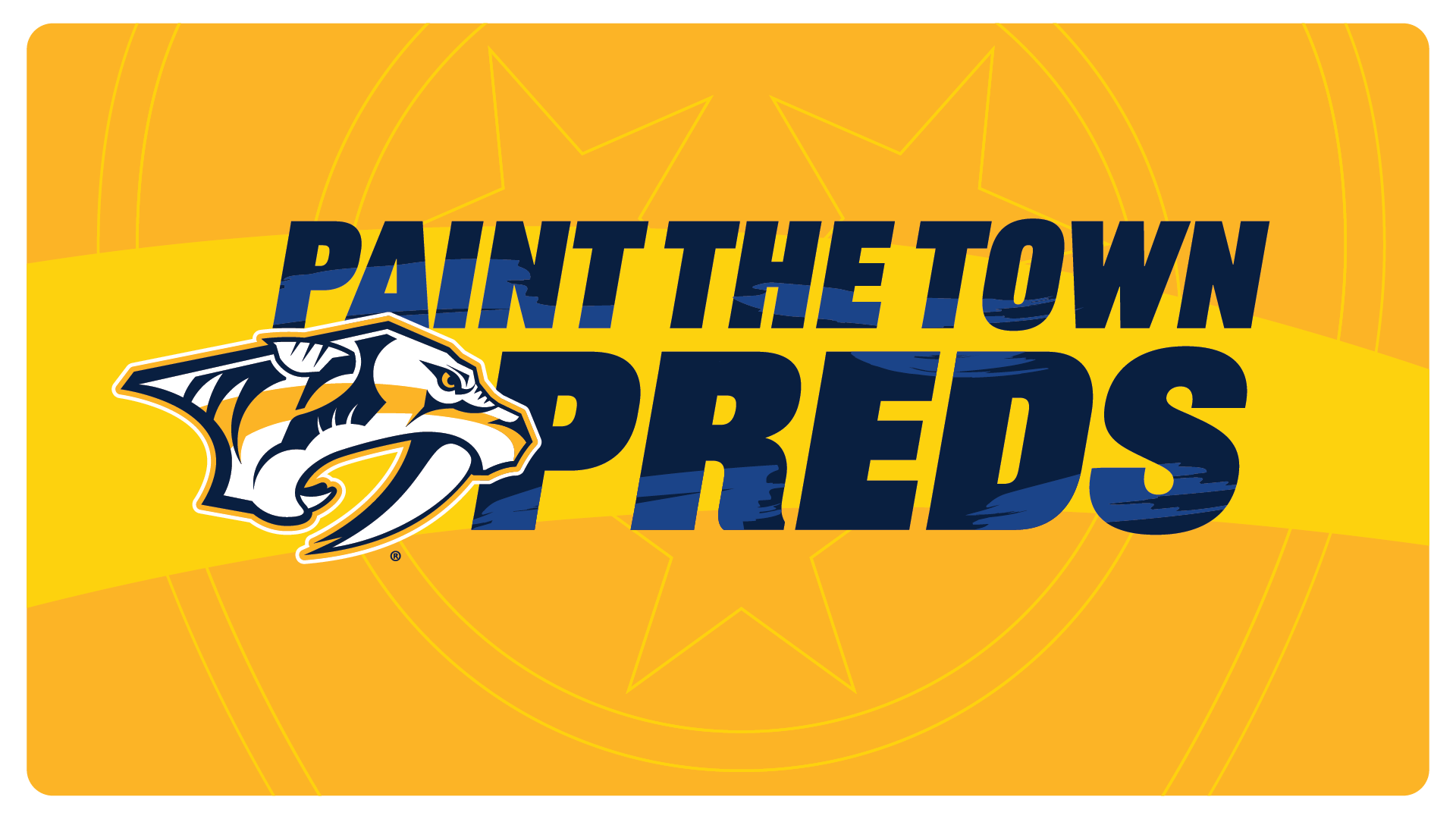
Brand Strategy
Our marketing team provided us with the phrase "Paint The Town Preds" as the season's core theme, a call to fan's and the organization alike for the city to embrace their Preds pride. To embody this concept, the focus became abstracting elements of the logos in order to create fun, more unique compositions. These can be seen in the fang shapes, stripes, and logo wireframes incorporated throughout the season's graphics and marketing materials.